Image Transform API#
Use Snapkit's Image Transform API to perform real-time image transformations via URL parameters. Built on the Sharp↗ library for high-performance processing and CloudFront CDN, it provides fast image delivery worldwide.
Quick Start#
Basic Usage#
Add query parameters to uploaded image URLs for real-time transformation:
GET https://{organization}-cdn.snapkit.studio
  /{project}
  /{path}
  /{filename}
  ?w=800&h=600&fit=cover&flip=true&grayscale=true&dpr=2
URL Components:
{organization}: Organization name (e.g.,acme-corp){project}: Project name{path}: Folder path{filename}: Image filename- Query parameters: Transform options (
w,h,fit, etc.)
Key Features#
- Real-time transformation: Instant image transformation via URL parameters
- CDN caching: Fast image delivery from CloudFront after first transformation
- Automatic optimization: Automatic format selection based on browser capabilities
- High-resolution support: Responsive image generation based on DPR (Device Pixel Ratio)
Transform Parameters Reference#
Size & Layout#
Parameter | Type | Description | Default | Limits |
|---|---|---|---|---|
w | number | Width (pixels) | Max 4,096px | |
h | number | Height (pixels) | Max 4,096px | |
fit | string | Fit mode: | cover | |
dpr | number | Device Pixel Ratio | 1.0 | 1.0-4.0 |
Transform & Effects#
Parameter | Type | Description | Limits |
|---|---|---|---|
rotation | number | Rotation angle (0-360 degrees, auto-normalized) | |
flip | boolean | Vertical flip | |
flop | boolean | Horizontal flip | |
blur | number | Blur intensity | Max 20 |
grayscale | boolean | Convert to grayscale |
Region & Format#
Parameter | Type | Description | Limits |
|---|---|---|---|
extract | string | Extract region (percentage): | 0-100% each |
format | string | Output format: |
Practical Usage Examples#
Responsive Image Optimization#
High-resolution for desktop
?w=800&h=600&dpr=2.0&format=webp&fit=cover
Mobile optimization
?w=375&dpr=3&format=auto&fit=cover
Thumbnail generation
?w=200&h=200&fit=cover
Advanced Transform Combinations#
Portfolio gallery
?w=400&h=300&grayscale=true&blur=1&format=webp
Product images
?w=600&h=600&fit=contain&format=auto
Image crop (center 50%)
?extract=25,25,50,50&w=300&format=jpeg
Basic Transform Options#
Resize
?w=800&h=600&fit=cover
Rotate and flip
?rotation=90&flip=true
Blur and grayscale effects
?blur=2&grayscale=true
Crop specific region
?extract=25,25,50,50
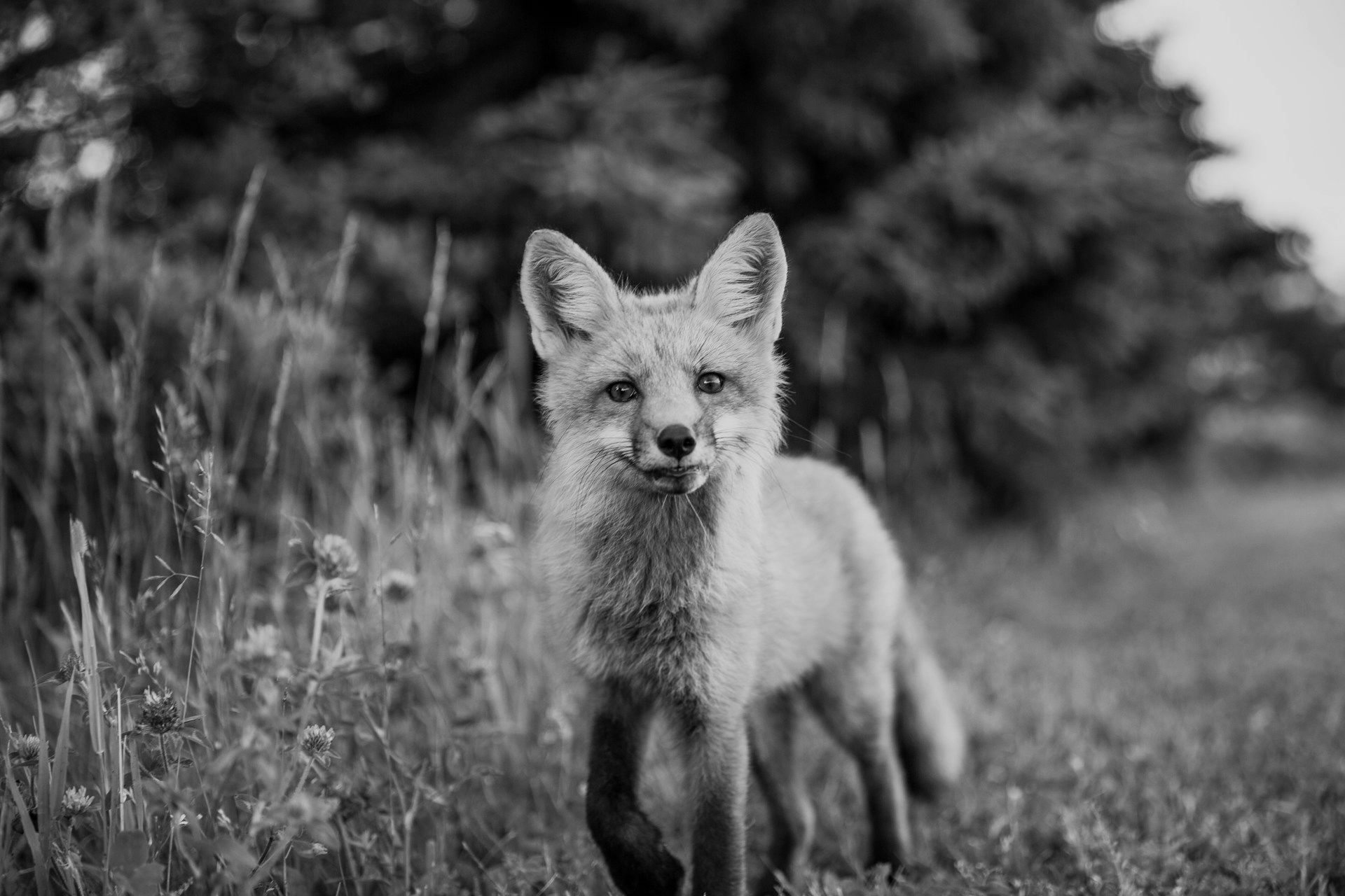
Extract 50% area from center (25% offset from each edge)

Resize applied (w=300&h=200&fit=cover)

Transform Effects Visualization#
Resize + High-resolution (w=300&h=200&fit=cover&dpr=2.0)


Device Pixel Ratio (DPR) Usage#
Adjust the actual image size for high-resolution display support. Calculate the actual image size by multiplying the specified size by the DPR value.
How DPR Works#
w=300&dpr=1.0→ Actual image size: 300px (300 × 1.0)w=300&dpr=1.5→ Actual image size: 450px (300 × 1.5)w=300&dpr=2.0→ Actual image size: 600px (300 × 2.0)
The browser still displays at the specified size (300px), but downloads a larger image for crisp rendering.


Usage Examples#
Desktop standard resolution
?w=400&h=300&dpr=2
High-resolution Retina mobile
?w=400&h=300&dpr=3
Transform Processing Order#
Image transformations are processed in the following order:
- Extract (region extraction) - Percentage-based crop from original image
- Resize (size adjustment) - DPR applied
- Rotation (rotation)
- Flip/Flop (flipping)
- Blur (blur effect)
- Grayscale (grayscale conversion)
- Format (format conversion)
Complex Transform Examples#
You can combine multiple transformations:
Size adjustment + grayscale + blur
?w=400&h=300&grayscale=true&blur=2
Region extraction + rotation
?extract=25,25,50,50&rotation=90
High-resolution display optimization
?w=400&h=300&dpr=2.0&format=webp
Mobile responsive images
?w=375&dpr=1.5&format=auto&fit=cover
Rotation and flip combination
?rotation=45&flip=true&blur=1
Performance & Caching#
CloudFront CDN#
All transformed images are cached on CloudFront CDN for fast delivery:
- First request: Transform original image and cache
- Subsequent requests: Instant delivery from cache
- Cache duration: 1 year
Accept Header-based Optimization#
When the format parameter is auto, the optimal format is automatically selected based on the browser's Accept header:
- AVIF-supporting browsers: Convert to AVIF format
- WebP-supporting browsers: Convert to WebP format
- Standard browsers: Convert to JPEG/PNG format
System Limits & Safeguards#
Processing Limits#
- Maximum image size: 4,096 x 4,096 pixels
- Input pixel limit: 268,402,689 pixels (approximately 16K x 16K)
- Blur intensity: Maximum 20 (CPU protection)
- DPR range: 1.0-4.0
Auto Fallback System#
Automatic handling when issues occur during transformation:
- Parameter errors: Automatically correct invalid values
- Transform failures: Return original image
- Memory shortage: Ensure system safety with processing limits
- Format errors: Convert to default JPEG format
Memory Optimization#
- Cache disabled: Sharp memory cache not used
- Auto cleanup: Automatic release of Sharp library instances after processing completion
- Single processing: Concurrency limited for memory protection
Integration & Usage#
Next.js Integration (Coming Soon)#
Currently under development. Coming soon.
Stay up-to-date:
- Join our Discord Community↗
- Star and Watch our GitHub Repository↗
- Check for updates on our blog
import { Image } from "@snapkit/nextjs";

<Image
  src="https://{organization}-<your-org>-cdn.snapkit.studio/{project}/images/hero.jpg"
  alt="Hero"
  width={800}
  height={600}
  transforms={{
    blur: 0,
    format: "auto",
    dpr: 2.0,
  }}
/>;
Responsive Image Implementation#
const getResponsiveUrl = (src: string, width: number, mobile = false) => {
  const dpr = mobile ? 1.5 : 3.0;
  return `${src}?w=${width}&dpr=${dpr}&fit=cover&format=auto`;
};

// Usage example
<picture>
  <source media="(min-width: 768px)" srcSet={getResponsiveUrl(baseUrl, 800)} />
  <img src={getResponsiveUrl(baseUrl, 400, true)} alt="Responsive" />
</picture>;
Next Steps#
- Next.js Integration Guide - Integrate with web applications using @snapkit/nextjs
- Figma Plugin Usage - Direct image optimization from design workflows
- Performance Optimization Tips - Strategies for improving website loading speed